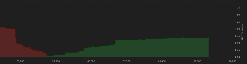
What is the connection between the graph on the ‘Market- offer book” page , and the red and green tables below it?
(I am a beginner to any stock market)
What is the connection between the graph on the ‘Market- offer book” page , and the red and green tables below it?
(I am a beginner to any stock market)
It represents the volume of offers made at every price. Red ones are people willing to buy, and green ones are people willing to sell.
Ok. Thankyou.
I’m confused by the column headings in the table and the y-axis in the graph. Let’s take the highest green point. The last buyer on the green side has a price of €67,704/BTC, which fits in the table on the far right; the x-axis is fine. What is the value of the y-axis (around 0.55 as the offer volume)? What unit does 0.55 represent? Bitcoin? In the table, this buyer is listed as 0.002 BTC or €135.
Given the link, could this imply that the correlation with the highest price – in this case €76,704 per BTC – is coincidental, and that there are actually other offers that are not yet known?Are they shown in the graph but not in the table?
y axis is the cummulative amount of BTC offered to be bought (green) and sold (red).
If you took all offers to sell BTC for eur right now, you would sell about 1 BTC, and would start selling at 65.000 eur/btc and end selling at somewhere between 52.500 and 55.000 eur per btc.
Bisq limits to 25% the amount of deviation for offers, so there are no extreme offers. Even at more liquid, centralized exchanges, these offers does not imply much info, since they tend to disappear before being taken if the market is having abnormal conditions that make it fall or surge 25% in a few minutes.