Hi guys,
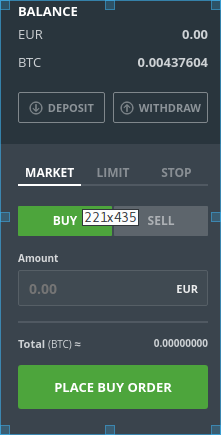
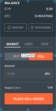
Thanks for the hard working and bringing the project to life, I wanted to add my personal experience on the project. I guess we should focus on making the platform easier to use. I was just trying to sell some dogecoins and I couldn’t because the interface was too complicated for me,
Agree there is headroom for improvements and any UI designer is very welcome.
Though I think and heard from many that it is not hard to use. Give it a try again.
Percentage means u peg it to the market price so 2% means 2% better to the market price (better for you).
Agree,it confused the hell out of me too in the beginning, but after you get it, it’s simple, so don’t give up Could depends on background.
I’m not a UX designer but maybe when I’ll have some time I’ll come up with a suggestion
This is a definite sore point in the UX. The multiplication should be presented vertically and without the mathematical symbols. The price or distance from market price should be one input, with an adjacent text showing the result of a % based price calculation. The directionality of the offset isn’t clear. It should be absolute and signed with both +/- being allowed whether buying or selling. Calculated fields should be rounded, not inputs.
That’s how I’d expect it to work, anyway. I don’t know know to make that look pretty.
Like the op, I tried and gave up too. I use all the other exchanges, there isn’t enough incentive for folks to bother ‘learning’. If it isn’t completely obvious and idiot-proof then it can never get anywhere in the liquidity war between big exchanges imo.
I applaud the objectives and efforts of this community, but yeah, sadly the exchange is too complex for the uninitiated and very few people will bother giving it second glance when they first take a look and realise that.
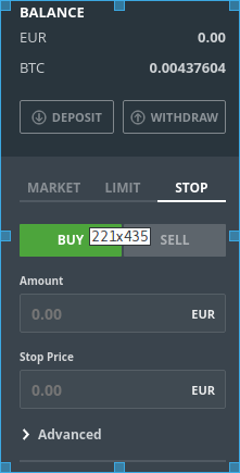
When you trade there’s already a order jargon : Market (buy asap), Limit (maximum price), stop (minimum price)
Furthermore all the major platforms have quite very similar design. I’m sure there’s a reason for that. I guess a good move would be to copy those kind of design.
Another point is BTC as the base currency, most of new comers are paying with fiat, and reasoning in fiat currency still, it would also help to change this.
Even non newbs I was stumped a few days ago when trying to make a percentage offer. If their is nothing in the % field the total fiat amount of the trade is blank and you cant create offer. Took me way too long to figure it out. Maybe default it to 0% instead of blank? Need to get motivated and fire up an IDE, maybe I can contribute in some small way, but I havnt done any programming for a long time
Great thanks for reaching out! @christoph is leading the UX work and there is already some good discussions and work on improvements. Please join also the Bisq Slack channels (UX) as much of the communication takes place there. Might be a bit less over the holiday now ;-).
I must agree. I am working like UI/UX designer and I am new in coins market. I tryed alot of platform in last week and only two for me have good UI for beginers - coinbase and exodus wallet. I studied alot of materials about altcoins and buy some from binance (no greate UI but with little focus is possible use it). I am triing two days buy Siacoin (SC) and it is absolutely terrible experience with temporarily unavailable/overloaded or f*cking retardet verification proces with three platform (bittrex, shapeshift, poloniex).
Right now I am triing use Bisq but I am lost to… I hope that in this forum will be possible find some informations which will help me set my acc and buy finally that altcoin. I think it is global problem with cryptothings which are created by geeks for geeks, no for “normal” people that is huge barier and if anybody break it, will be a king of the coinjungle.

 Could depends on background.